You like Farmhouse house plans: you talked, we listened! Without further ado, here is the photo / guided tour of one of our “best seller” Farmhouse plans in the affordable “Farmhouse” category, Plan # 6102, also called Nordika.
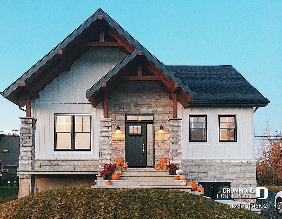
Farmhouse plan #6102 by Drummond House Plans
In this article you will discover ideas for decorating your home, stores that offer affordable Farmhouse decorations as well as a variety of ideas to bring out the best in your indoor living spaces.
Let’s get started… For those of you who didn’t know, my better half and I are the happy owners of the house the photos were taken from below. Built in the summer of 2019, our little Farmhouse plan could not be more welcoming. Here is the almost complete list of accessories from our Nordika, which will surely take you to places where you would not necessarily have thought of to buy some decorative accessories.
FARMHOUSE PLAN – MAIN ENTRANCE
For us, the entrance had to be as flashy as it was inviting. We wanted our visitors to feel the warm side of our home as soon as they walked through the front door.
In construction, we have slightly modified the entry of the original Farmhouse plan by changing the closet corner for a beautiful large walk in. And I admit that it is really a “game-changer”. Today I couldn’t live without my “locker room” (and it is also my dog’s favorite sleeping spot!).
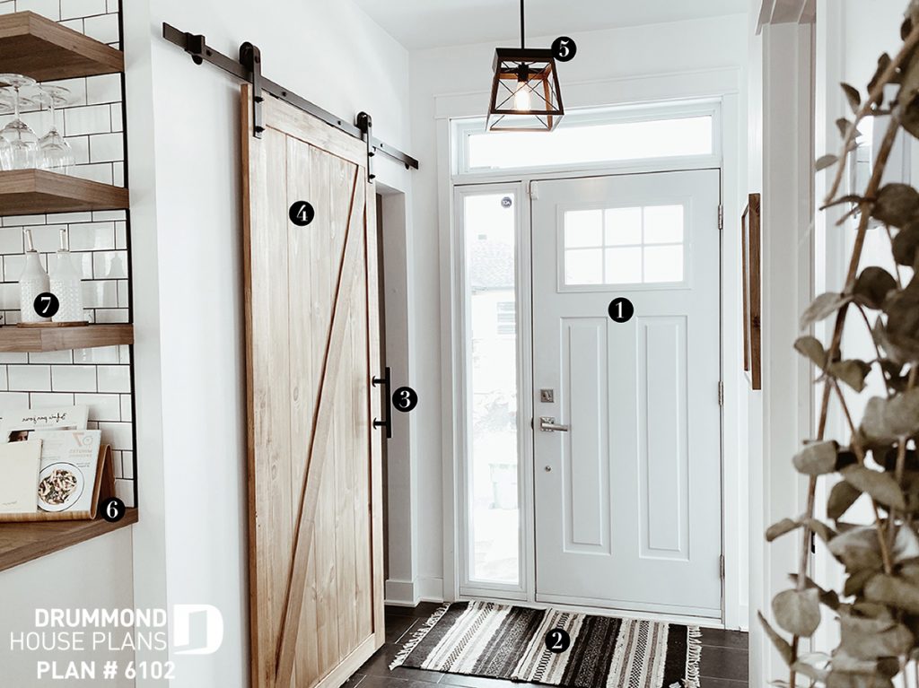
2 : Rug / HomeSense
3 : Handle / Wayfair
4 : Sliding barn door / Rona
5 : Lighting / Royaume Luminaire
6 : Book holder / Renaud Bray
7 : Ceramic oil bottle / Walmart
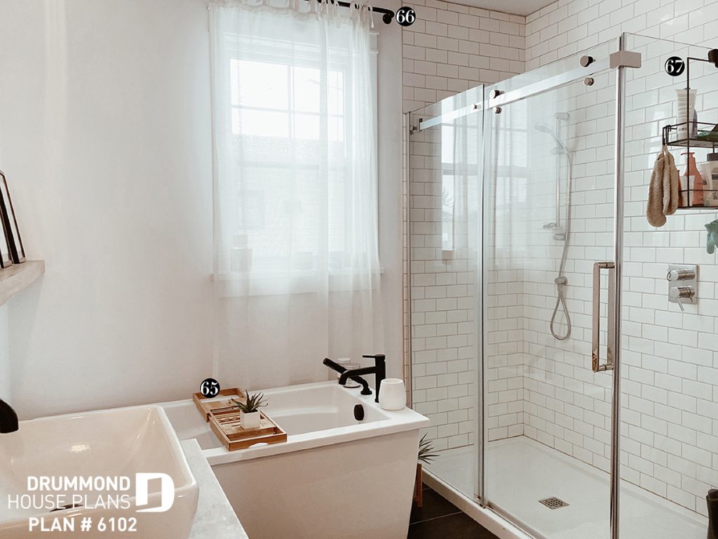
Here is the entrance walk in closet that makes all small families dream. A set of locker style spaces, benches, shelves, hooks and poles. For the pole, we had to be more creative … We do not find poles that are installed upside down everywhere. Therefore we took the same as item # 66 used in the bathroom, giving it a different purpose. Placed on the reverse, it can thus accommodate several hangers!
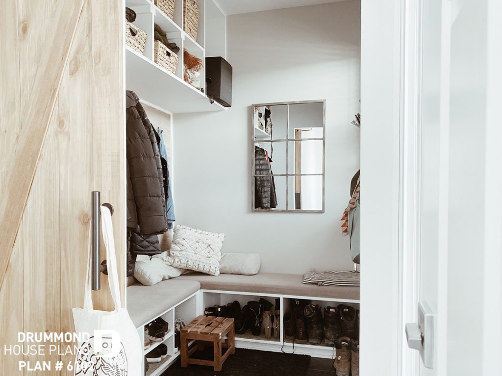
+ rattan baskets / Canadiantire
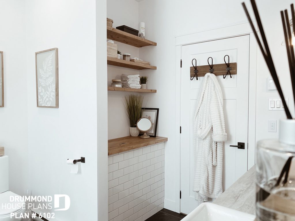
If we continue the tour, here we are in front of the bathroom. For those interested, the model we used for interior doors is the “Craftsman” model. You will probably find some at your interior finishes retailer.
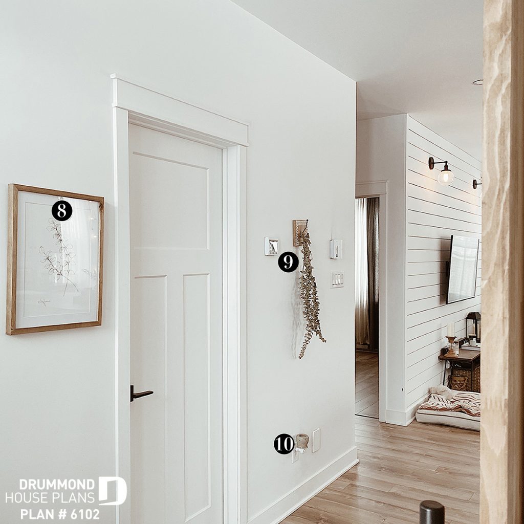
9 : Eucalyptus / Rose Drummond
10 : Candle wax diffuser / Pro Bass
MODERN FARMHOUSE PLAN KITCHEN
In reality, we have built the Farmhouse house plan # 6102 as an “reversed” option from what you see on our website in order to take better advantage of the orientation of our lot and natural light. So that you can better visualize it, I have therefore inverted the photos I took so that they correspond with the floor of plan # 6102 on our website.
Small comment: it is important to think about the orientation of the lot and the sun in order to choose the floor plan that will provide you with the maximum amount of natural light. All our plans are available as a “reverse” option and can also be modified in one of our regional offices or online.
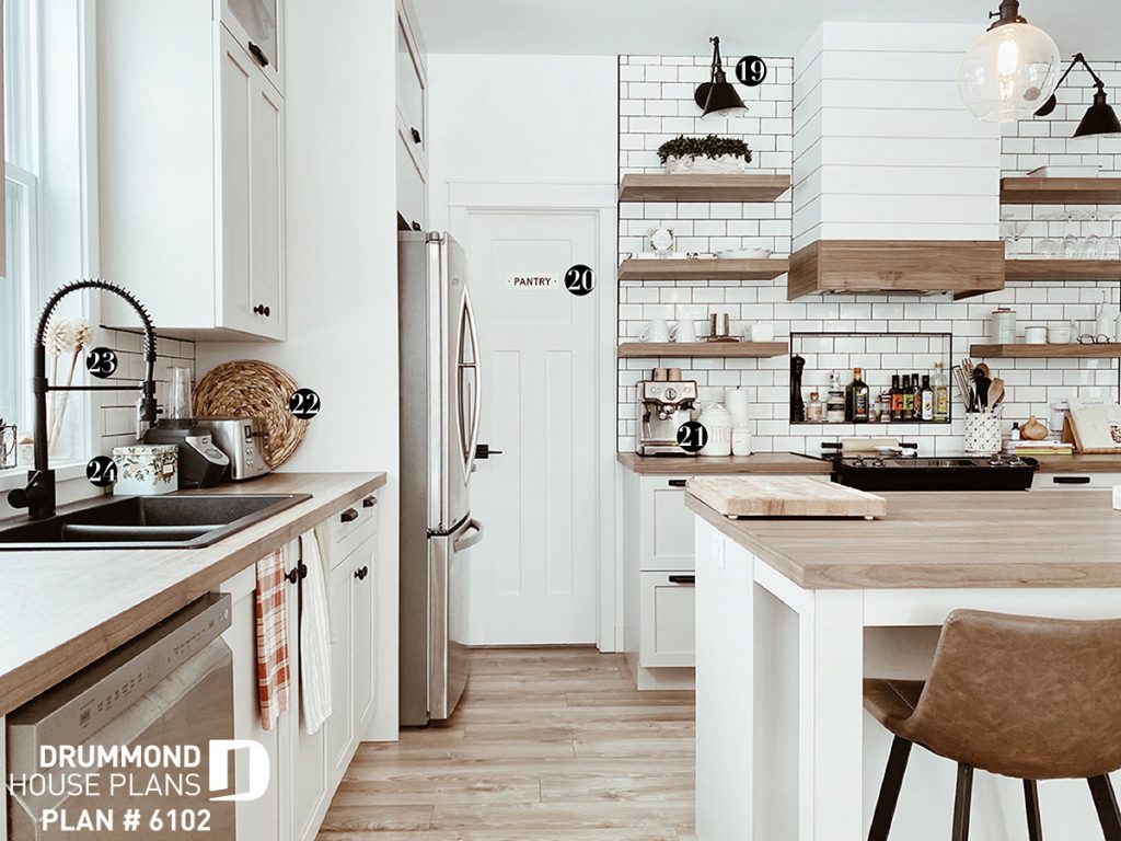
One of the small changes that were made in the kitchen were to put the sink under the window and then change the layout of the fridge and oven.
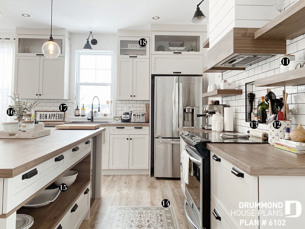
One of my favorite elements of the kitchen in our Farmhouse house is the built-in behind the oven. I love it! So practical and at the same time it adds a little decorative touch with oils and spices. Another aspect that I like about our large kitchen is the huge island that opens onto the living room and the dining room.
RECENT ARTICLE FROM OUR BLOG THAT MAY INTEREST YOU:
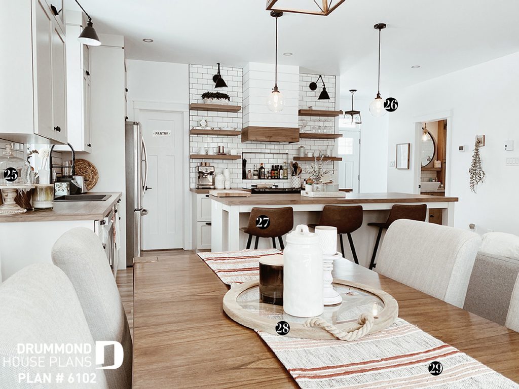
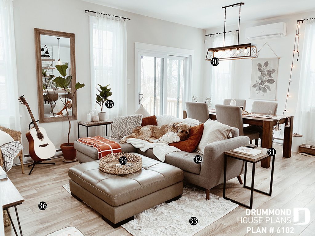
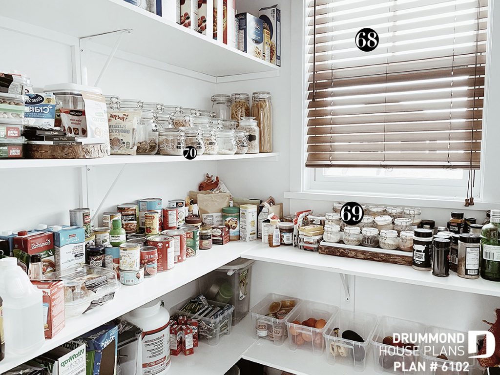
(s’ouvre dans un nouvel onglet)”>n BUT … what I like most, honestly this time :), is our stove hood. Surprisingly, no it’s not more expensive to make a built-in hood, contrary to what everyone believed (including me). Obviously, it goes without saying that is will depend on the materials you will use … But it is pretty much the same seeing as we save a lot of money to start with (since it is not exposed with the stainless chimney) . We just balance the cost with the wood, etc. to make the base. I am very satisfied with the choices we made for the kitchen of our Farmhouse house. The laminate counter was a perfect choice and quite economical. The layout of the pantry is ideal. In my opinion, we don’t need to have a view of the street… I prefer to have a view of the backyard. This is why I opted for a pantry in front to have more space in our living space located in the back. I really like the fact that our living room and dining room are open to each other. For us it is practical since we often eat / snack while listening to our favorite TV series. What I like most about this open space is the arrangement is the window setting. The fact that our windows are simple, large but not too large, allows you to add touches of home-style Farmhouse decor here and there. Having had too large windows I would have been limited in the layout of the space in order to be able to put the decorations that I wanted so much to add (frame and mirror). Choosing the floor plan is always difficult. But sincerely, I RECOMMEND that you choose the laminated type of flooring that we have chosen. With a dog, the floor is often covered with hair and dirt. The pale color combined with a slight veining perfectly camouflage the small traces that it can leave behind (clumps of hair, half-crunchy treats, saliva from old toys, traces of wet paws). In addition, we see no traces of clawmarks, big “must”! Many will likely be familiar with the term “ship lap”, made famous by the very talented designer Joana Gaines from the HGTV show Fixer Upper. For those who are not, it is actually the wall behind the television. A very simple wall to make. Let me explain: we used our leftover baseboards (we had ordered extra or we would have run out of them), then we put them down and nailed them one by one, leaving the space of a big nail between each of them . The nail holes were simply filled with a hole filler, then sanded and painted. It makes such a difference in our living room. I would put it everywhere in my Farmhouse plan if it was only up to me! Little anecdote … You may notice that the couch and the ottoman are not the same … It is that we had a little technical problem when we moved into our new house. Our old couch was too big for the living room, it seemed oversized. So we chose a new couch and until we find the perfect ottoman, we keep the old one. We do what we can ? For this section, I will not use term “WE” because it is really more “I” … Ha! Ha! I was just walking around Rona’s to buy some supplies for my boyfriend, when I heard a subtile whisper, “Pssst Jennnnnn”. I turned around and they were there, on sale for $ 5, and I just had to adopt them … Who would have thought that simple decorative wooden shelves would have made me spend countless dollars and time. But they were worth it and still are! A tip for you: if you like wooden shelves and have a space in the house that allows you to install them and you are looking for ideas: type “built-in shelves” in Pinterest and create a board for find THE decorations that suit you. When you go shopping, don’t buy all of a sudden, trust me you’re going to get tired. A little corner like that must be made with time and love. If you only knew how often I change the location of the decorations … We now arrive to the bedroom, the only one on the main floor. The most cozy place in the house. A half wall of “board and batten” to give a “Farmhouse” look, a pole stretched to its maximum to extend the curtains as much as possible to give an effect of “grandeur” to the window then a small green-gray eucalyptus in color on my walls. When we moved, I initially chose a nice little ceiling light for our room. But over time, I found that a key was missing. Something was missing to make the room even cozier than it was. Then, during another one of my strolls at Rona’s, I saw this little bamboo dome and I just knew it would be perfect. I knew it was the missing element in the room. Good thing because we will need a ceiling light in the basement soon. If I had to add something, it would be a carpet. We had one before … Before we had a dog. Many people ask us if it bothers us to have just a room on the ground floor? And to be honest not so much not. It allowed us to have so much larger living spaces upstairs. We don’t have any children yet, and even if it is in the plans, we would do the same… We are already planning to move to the basement in the bedroom next to that of the baby and thus convert our bedroom upstairs office / nap corner for the baby. Our bathroom is really perfect for us. The laundry chute has completely changed our lives for the better. I am in love with our black taps, it gives a modern feel to our farmhouse style home. What I like about our bathroom is that you never see the toilet, it is well hidden between the shower and the wall. When the time comes and we are parents, the shelf + counter (on the picture below) of the laundry chute will eventually become a baby changing table. Last but not least, if you have been here! As I explained above, the pantry overlooks the street, so it was essential to put a blind in order to avoid passers-by seeing the content of our pantry… Lately, I have found such satisfying pleasure in putting my spices in small jars, it seems that I feel more eco-friendly. In addition, I recently found the perfect labeling machine to name it all. That helps to stop putting powdered cloves instead of nutmeg in my muffins. Our kitchen looks bigger thanks to our pantry. We were able to put shelves and decorations. So yes, opt for a pantry if you can !!! Hoping that you found inspiration for your decoration projects, renovations and / or new construction in this article. Check out our Farmhouse house plans here> Several versions of the Nordika plan above are available on our site, see here>
12 : Utensil holder / HomeSense
13 : Rolling pin / Target
14 : Rug / Ambiance Simone
15 : Kitchen ware collection / HomeSense
16 : Floral / Magnolia Market
17 : Frame / Walmart
18 : Tea storage / Home Goods
20 : Sign / Magnolia Market
21 : Coffee machine / Doyon Després
22 : Rattan plater / Target
23 : Wooden dish brush / Les mauvaises herbes
24 : Recipe boxe / Ambiance SimoneFARMHOUSE PLAN: KITCHEN + DINING
26 : Lighting / Amazon
27 : Bar stool / Bouclair
28 : Platter / Boutique Déco Design – Laferté
29 : Table throw / HomeSenseLIVING + DINING
31 : Side coffee table / HomeSense
32 : Sofa / Structube
33 :Rug / Simons
34 : Platter / HomeSense
35 : Floral / Target
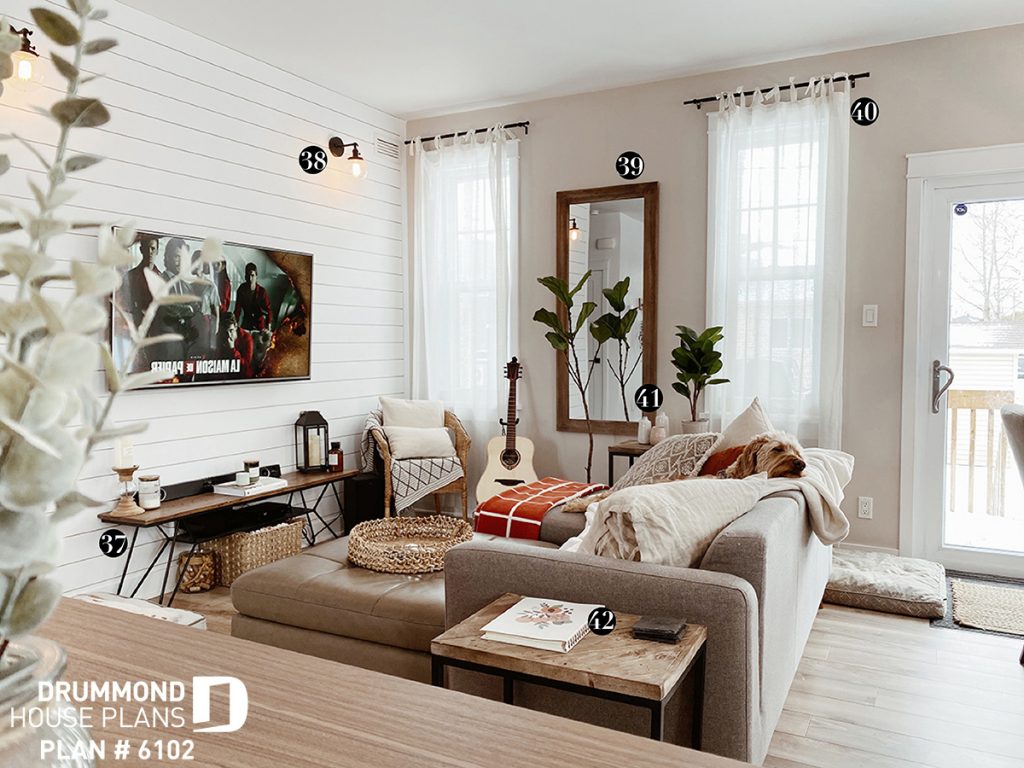
36 : Wood flooring / BMRFARMHOUSE PLAN LIVING ROOM
38 : Lighting / Amazon
39 : Miror / Walmart
40 : Curtains / Bouclair
41 : Vases / Magnolia Market
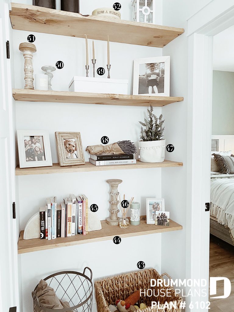
42 : Agenda / Trois fois par jourFARMHOUSE DECORATION
44 : Shelves / Rona
45 : Book end / Target
46 : Diffuser / Ambiance Simone
47 : Small basket + lavender / À la maison co. + HomeSense
48 : Lavender / Jean Talon Market in Montreal
49 : Candleholder + candles / Target
50 : Candleholder / CPC
51 : Candleholder / TJ Max
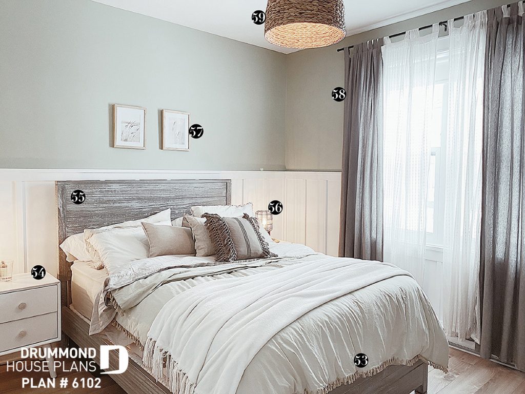
52 : Brie cooker / Renaud BrayBEDROOM
54 : Side bed table / Wayfair
55 : Bed frame / Wayfair
56 : Table lampe / Bouclair (article indisponible)
57 : Frames / Hobby Lobby
58 : Curtains / Ikea
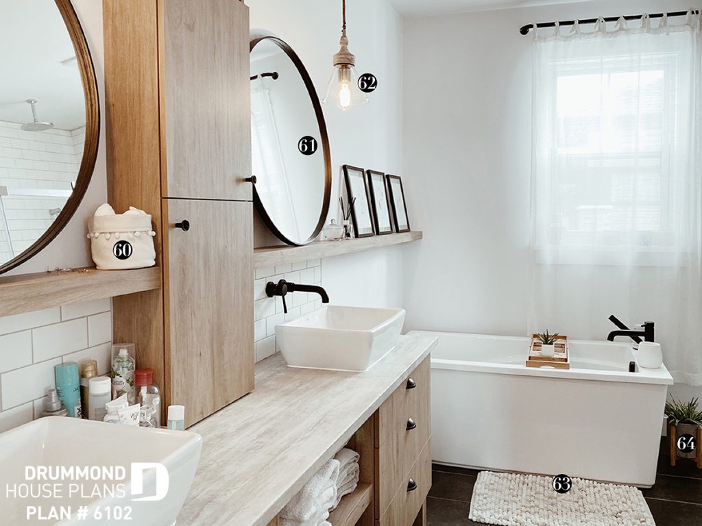
59 : Lighting / RonaBATHROOM
61 : Miror / Bouclair
62 : Lighting / HomeSense
63 : Bath rug / Linen chest
64 : Floral / Structube
66 : Rod / Bouclair
67 : Storage / Zone MaisonWALK-IN PANTRY
69 : Canister / Ikea
70 : Labeling / Trois fois par jour

